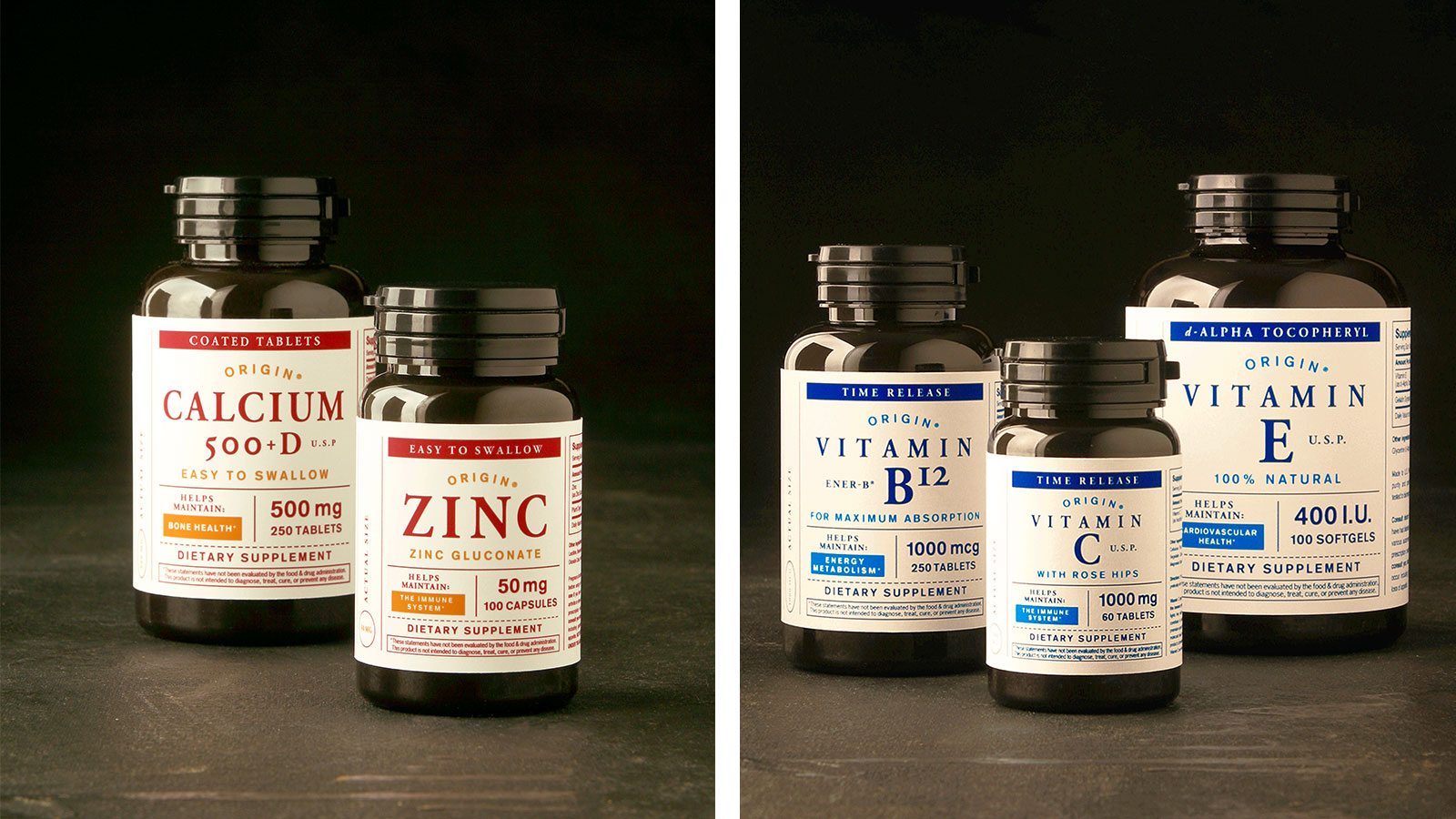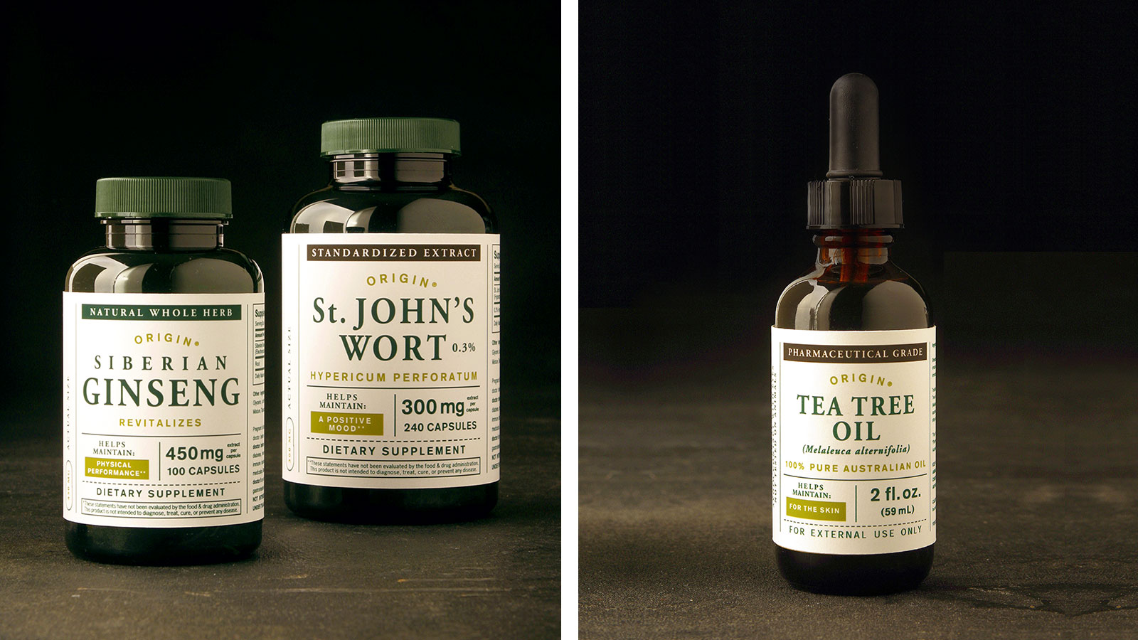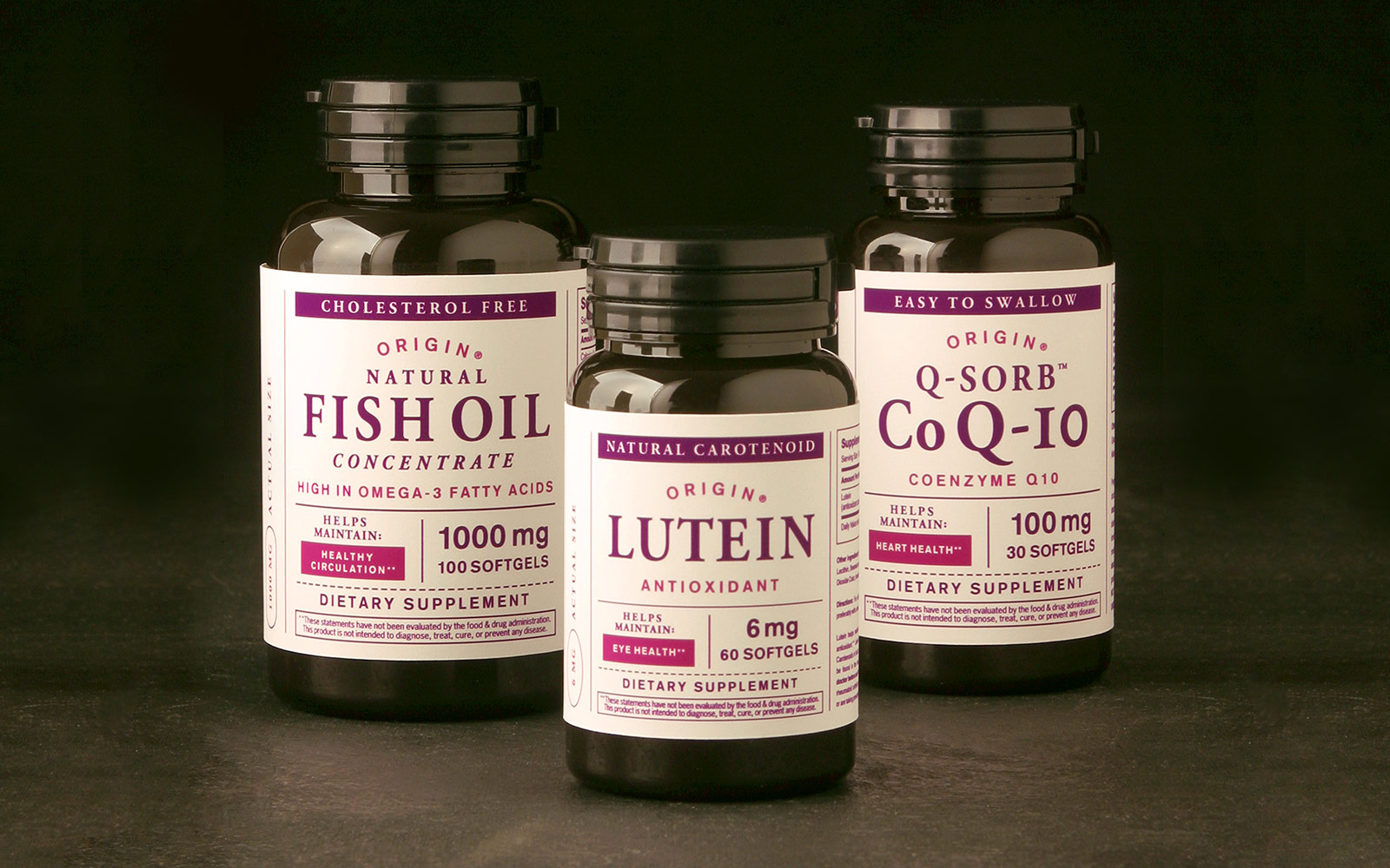
The assignment was to create an identity/packaging system for a Target own-brand 200 SKU product line of dietary supplements.
The tone and feel needed to reflect the strategic shift of the Target pharmacy, which was moving away from a medicinal vernacular with touting treatment towards a more holistic/organic tone and feel encouraging health maintenance. By nature, vitamins and supplements need to communicate a tremendous amount of information, in multiple layers, with limited real estate.
The solution, was to strip away any and all pretense (decoration) in favor of an accessible organizational structure with an emphasis on content and hierarchy. The classic typography when paired with straight-forward information architecture creates a personality that can best be described as traditional “apothecary” mixed with a hint of modernity. Its bright color palette of accents, helping the Target guest to quickly differentiate between segments of the product line and identify the relevant information.