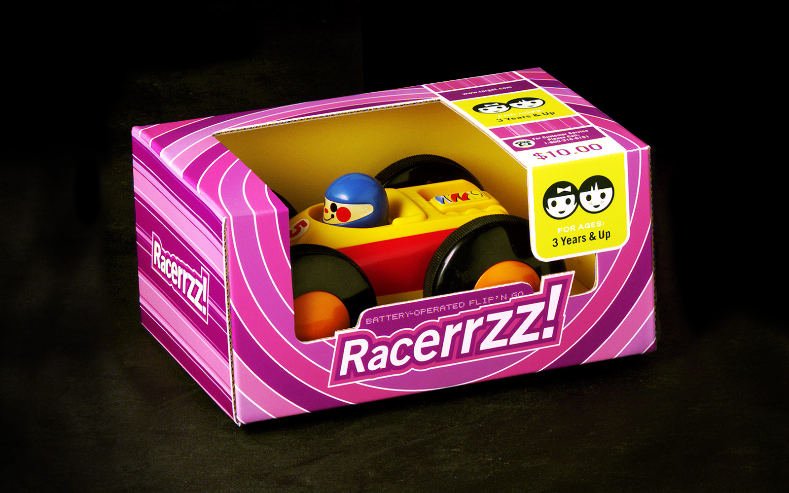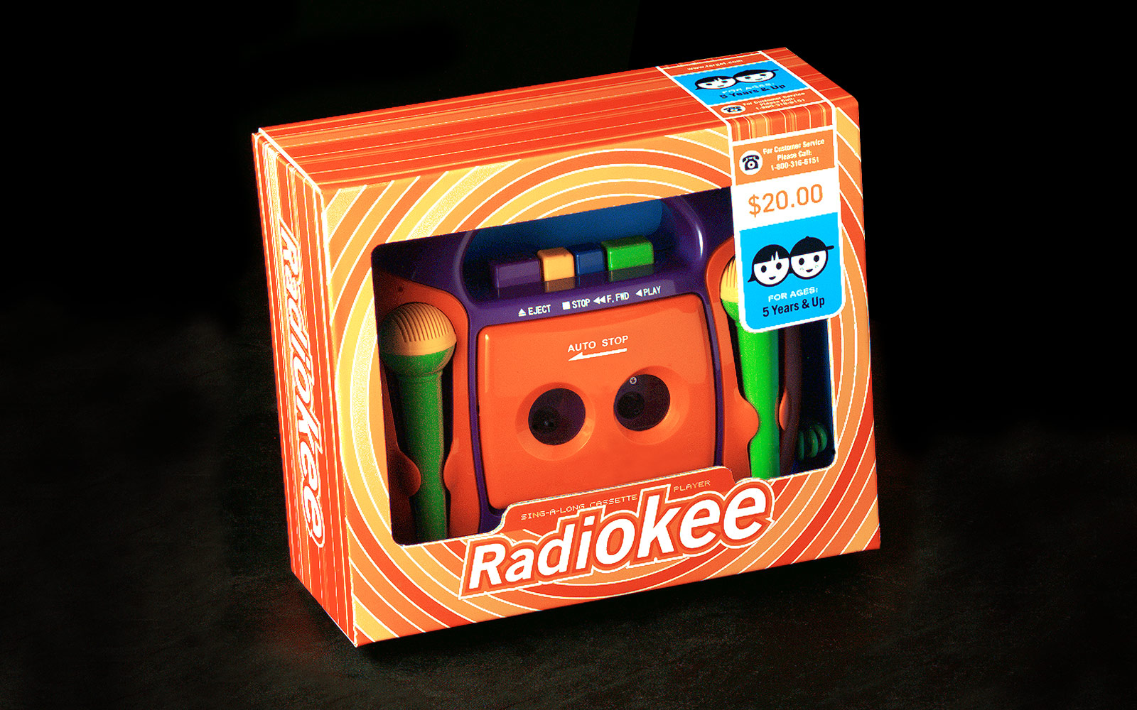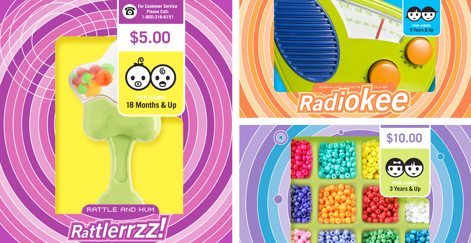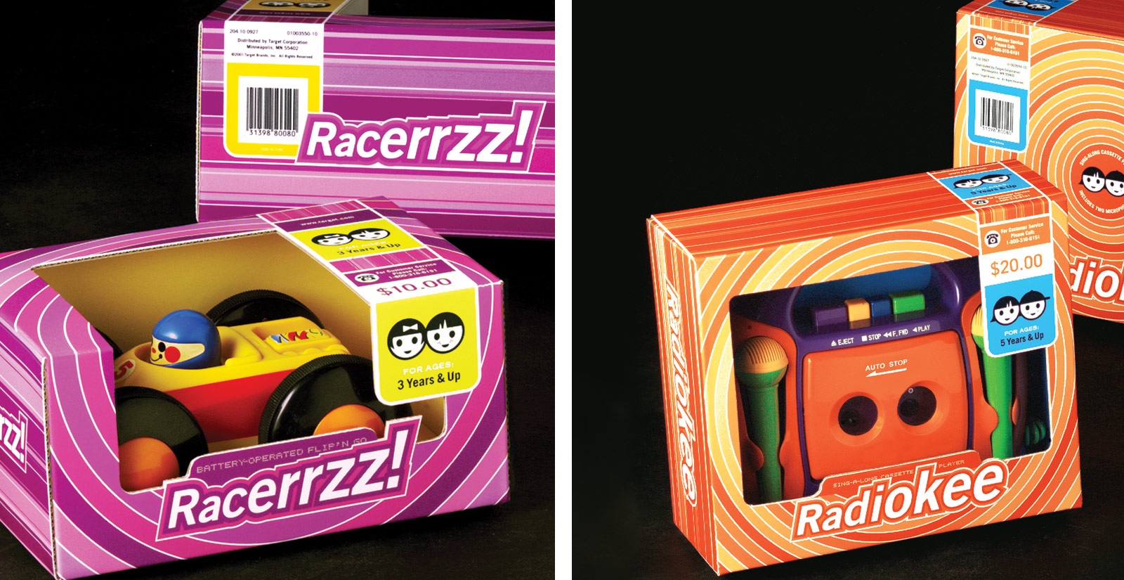
This toy packaging assignment for Target might otherwise be described as “How to create a brand personality without using a name or a logo.” Target, abandoning the name Kool Toys, wanted to develop a line of products for kids (i.e. toys) that would served primarily as inexpensive “gift-giving” opportunities.
This packaging needed to work across a wide range of product sizes and styles, all the while generating a sense of excitement. The solution, inspired by Japanese packaging, incorporated an energetic and gravitational spiral pattern that was printed in fluorescent inks. The iconography helped buyers discern between age groups and price ranges, and creates the illusion of a unifying logo in the absence of a true identifying image.
