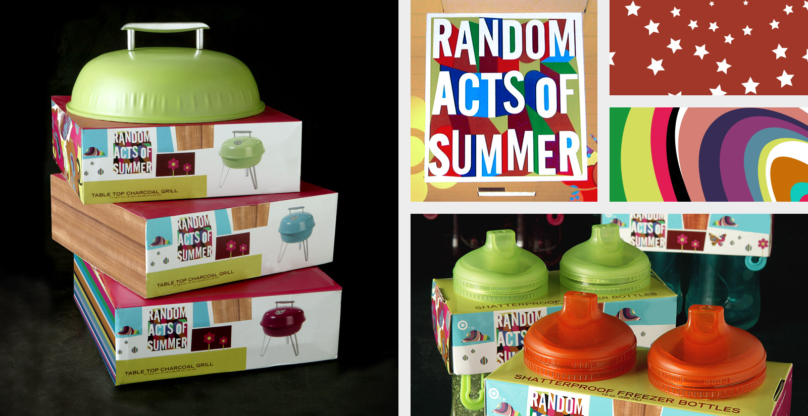
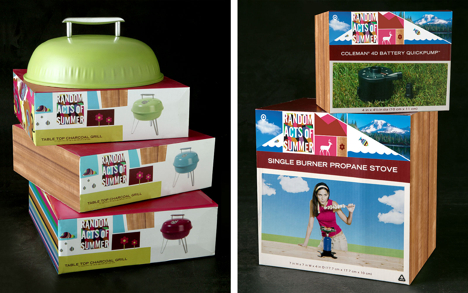
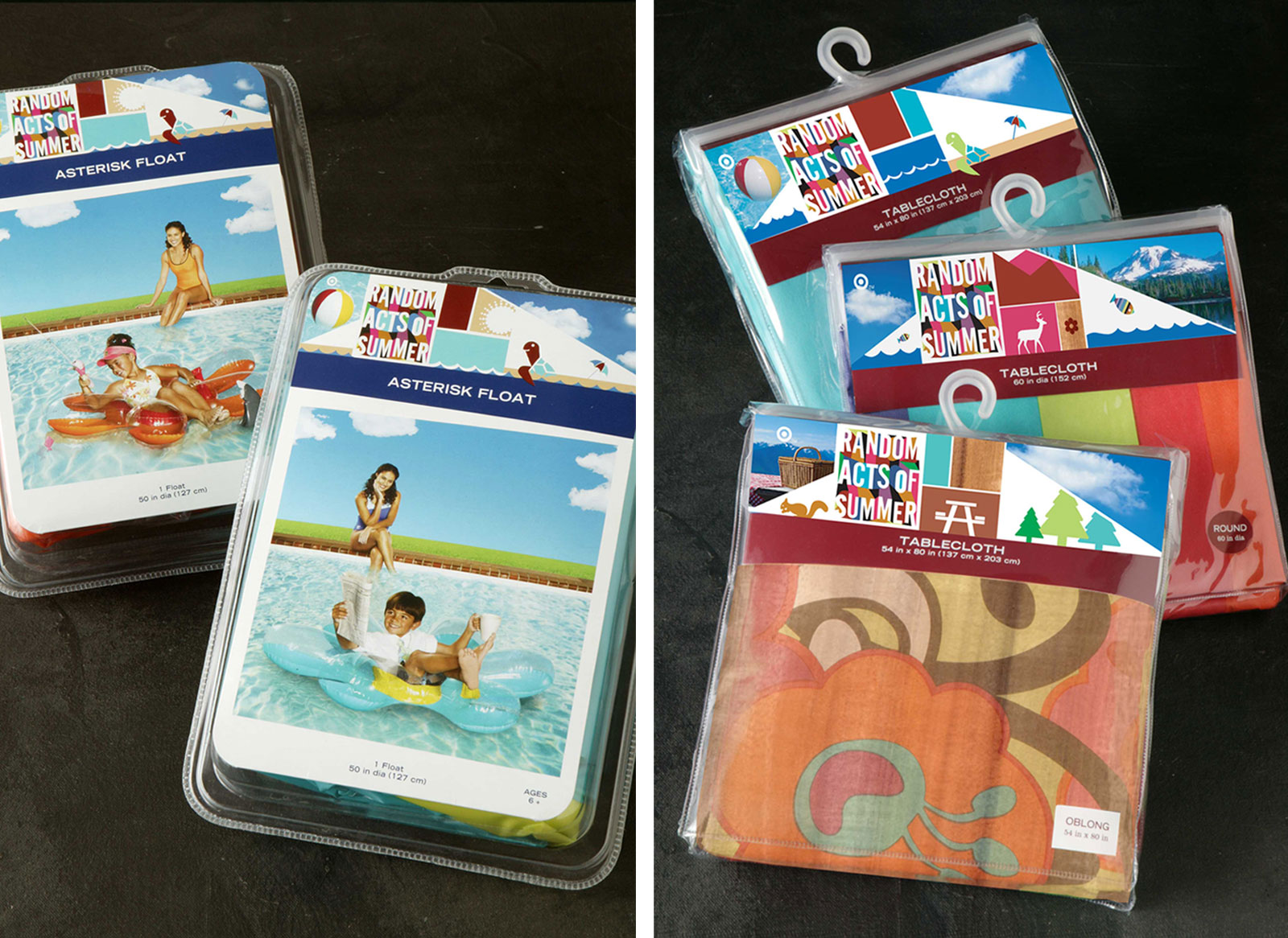
Target was looking to create an in store experience that captured the excitement of summer. We decided to create branding that’s gloriously rammed with color and movement. The logo and packaging needed to add personality to an otherwise common product.




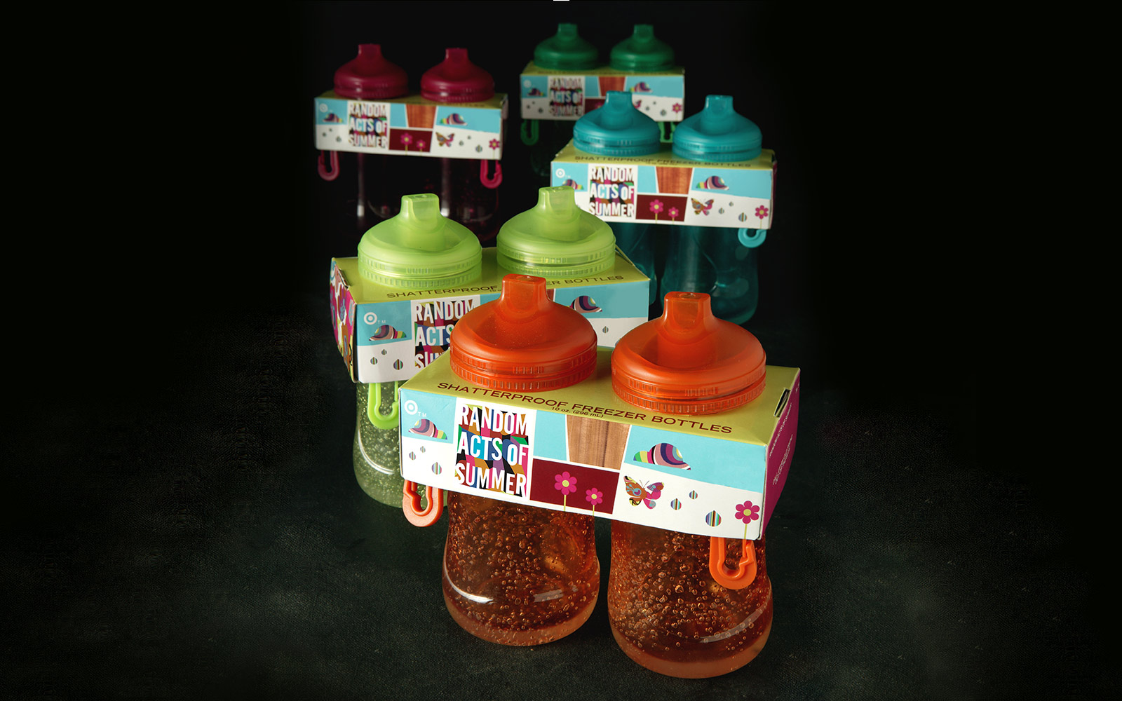
The packaging also used illustration patterned images that were used on the seasonal products themselves, which are seen in the cloud, raindrop, fish and butterfly shapes. Those elements included photographic images from nature, such as water, grass and wood.
The look and feel of the layout grid for the entire packaging system was deliberately meant to be “off kilter and random,” which included over 80 SKU’s of products. It’s important to note that the success of the design is based on the broad cultural meanings of the imagery. It made for a joyous brand experience. The result needed to be interesting, witty and fun, but smart as well.
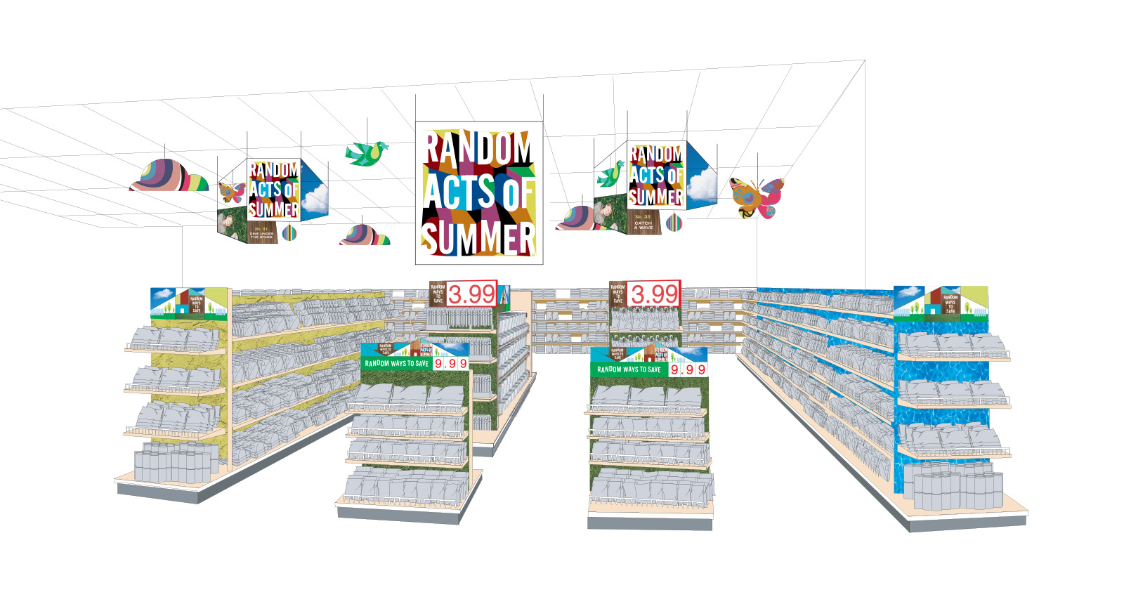
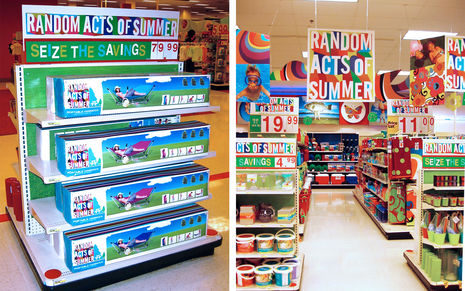
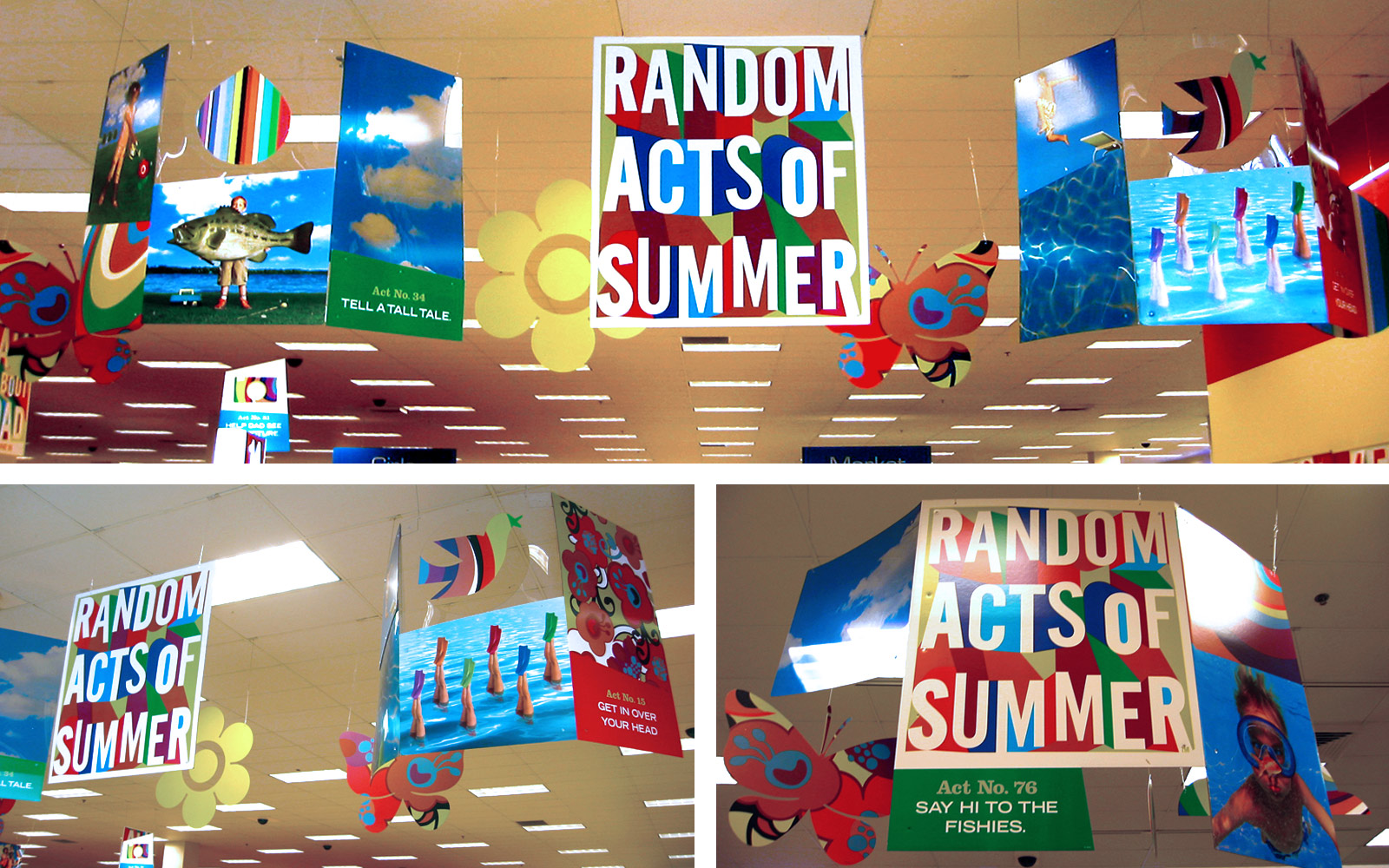
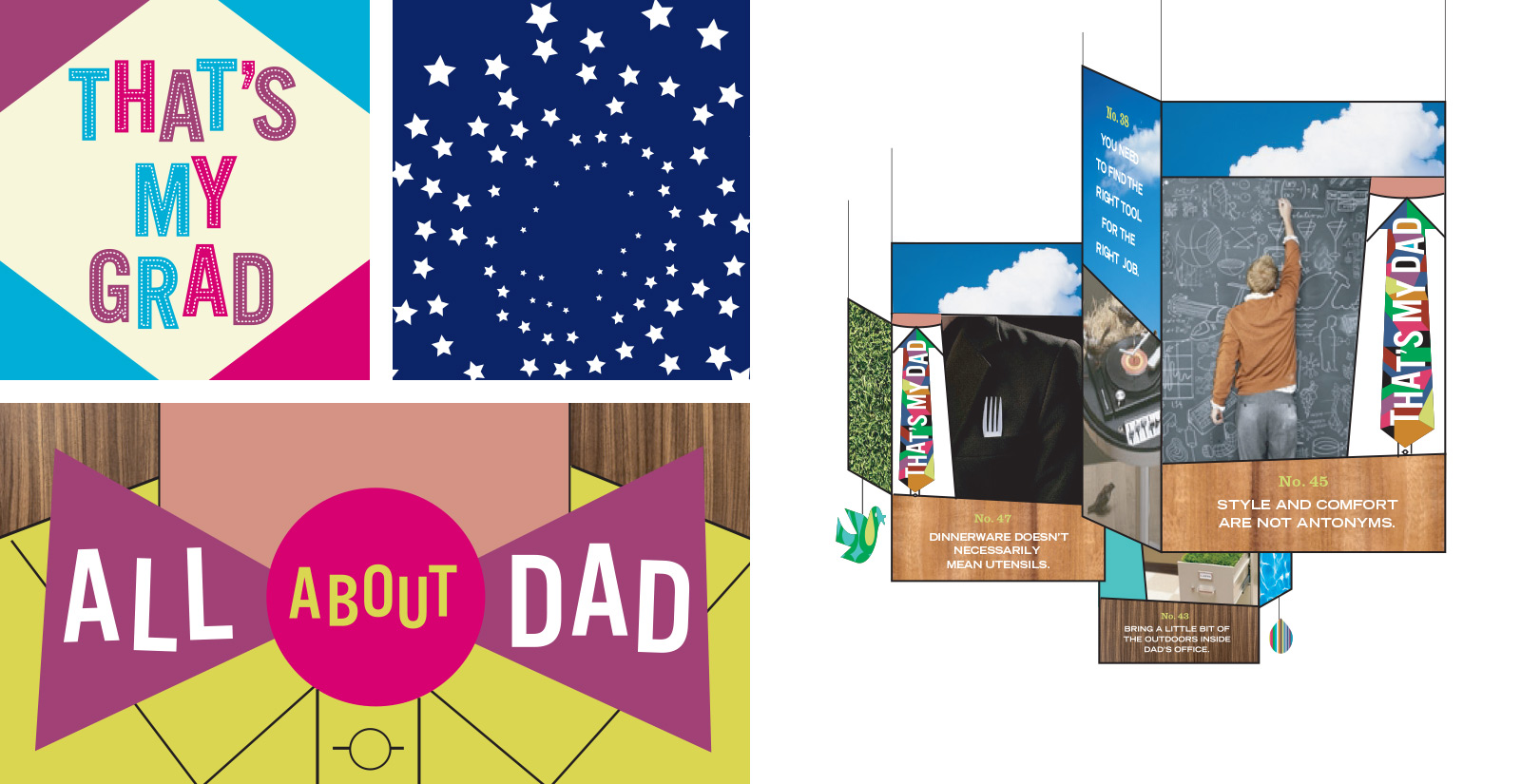
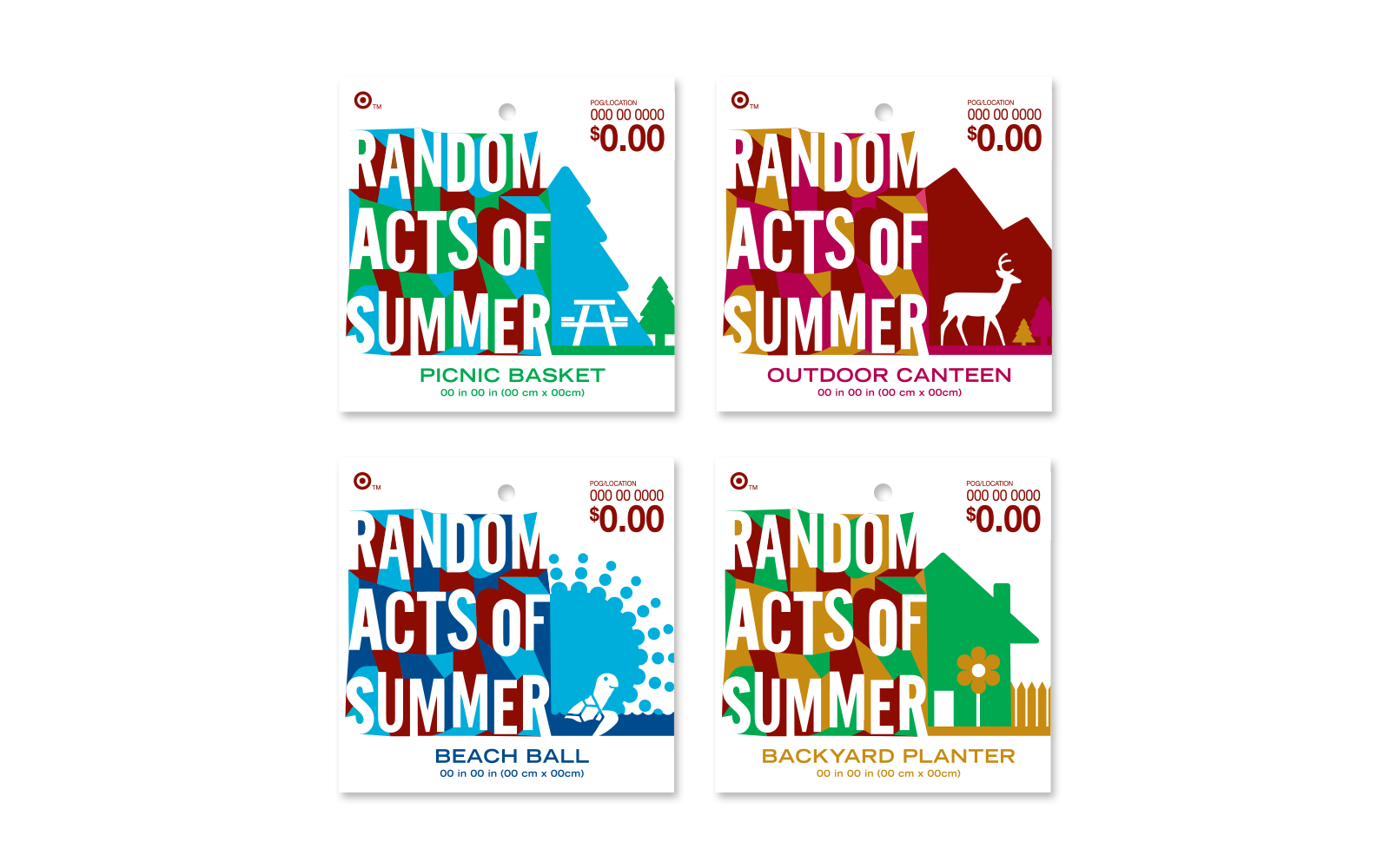
Since Summer season spans Father’s Day and the 4th of July, we needed to also provide additional graphic and imagery that shared the same strength as the summer branding and therefore, create a larger signage system.
