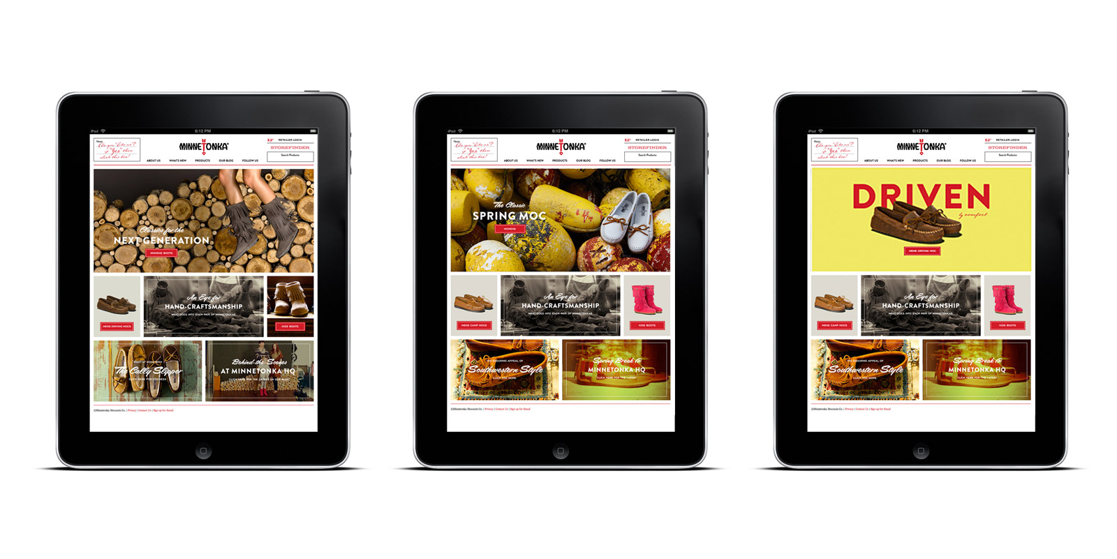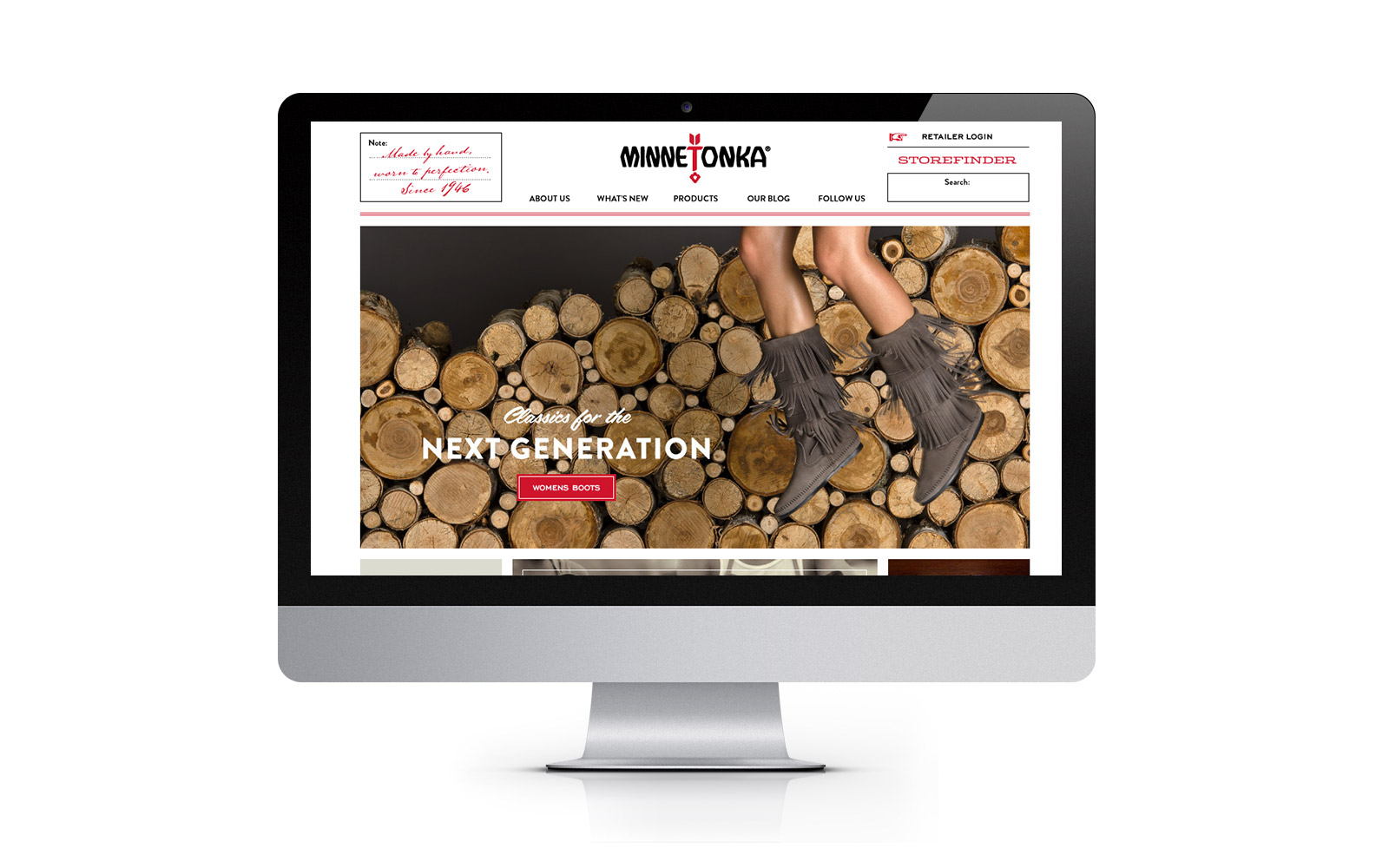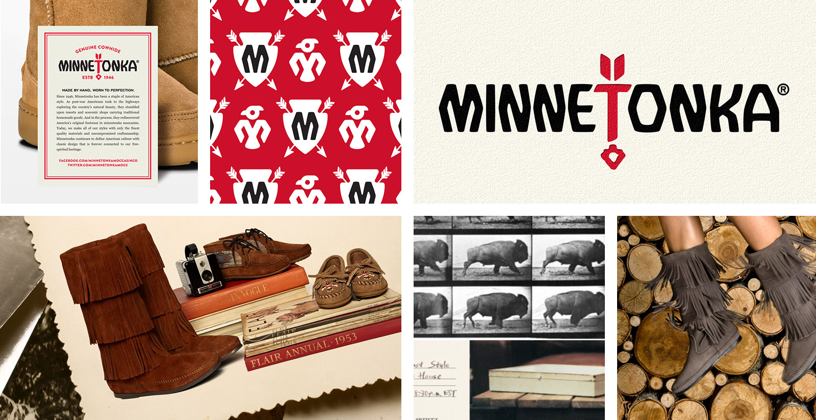
Repositioning a classic heritage brand for today’s digitally immersed consumer.
Minnetonka Moccasin Co. is a classic American leisure footwear brand. They are an authentic American heritage brand whose goods are expertly handcrafted, and use only finest quality materials. The style is inspired by the classic American wilderness.
Over the past few years, Minnetonka has evolved to be much more than that to hats, bags, and accessories. Their current branding did not reflect a broader lifestyle that embraces the independent and free-spirited that define the new American frontier.
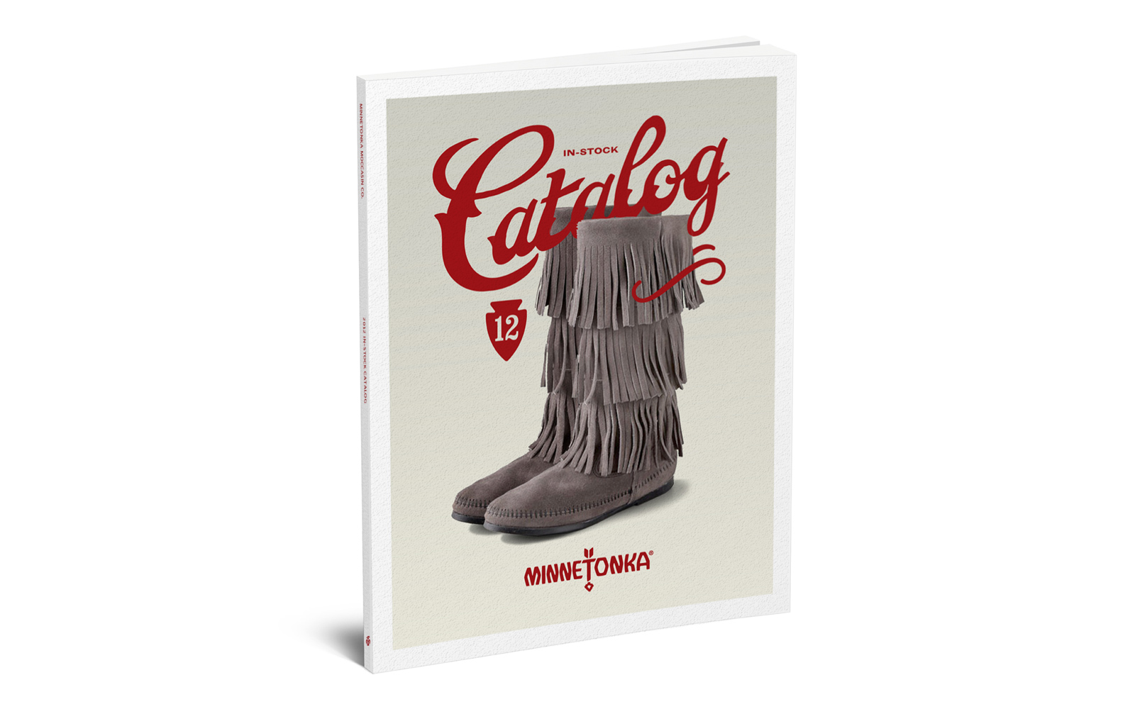
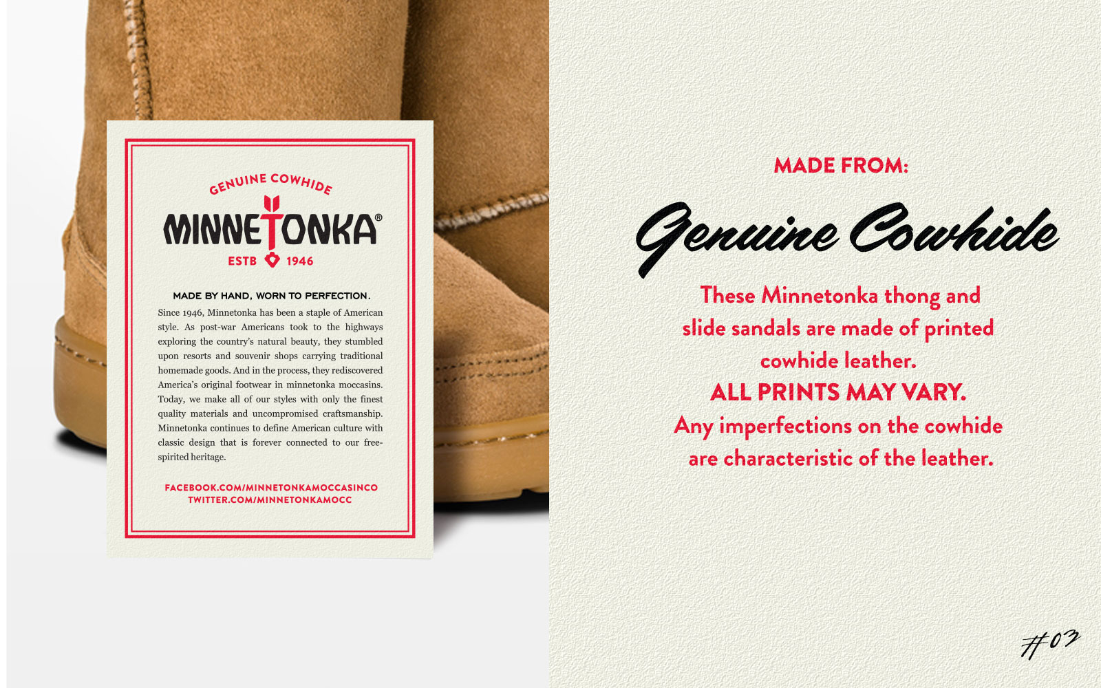
The core brand elements are rooted in the company’s humble beginnings, and evoke memories of the classic midwest trading post. Typography, illustration, and layouts take their cues from the ephemera of the late 40’s and early 50’s establishing authenticity within a timeless vernacular.
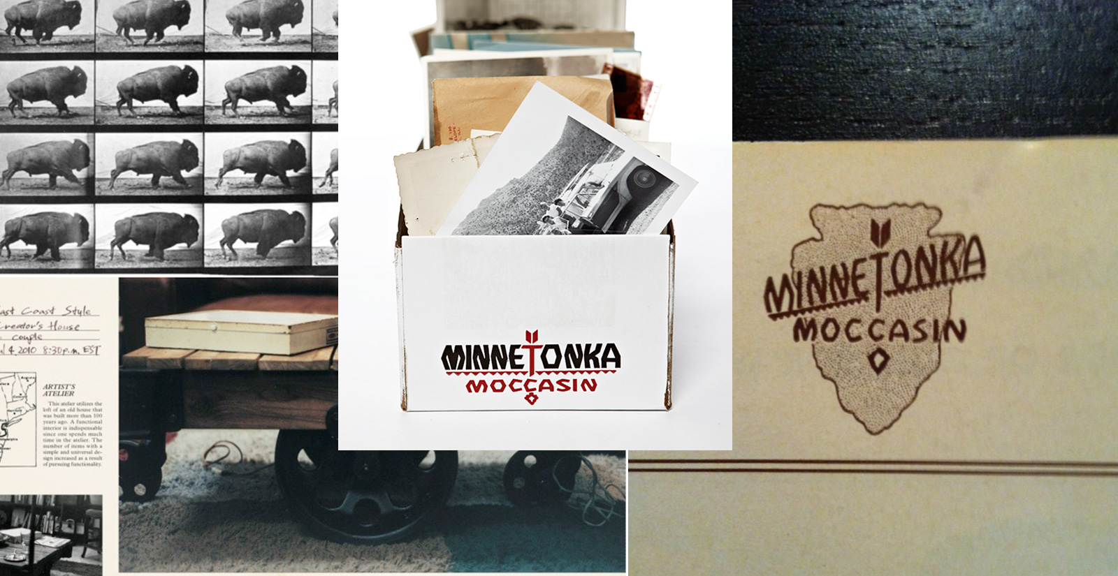
The majority of the equity in the Minnetonka brand lies almost exclusively in the memory experience of the retro logo on the white box. As long as we don’t disrupt this experience we can evolve the branding without concern.
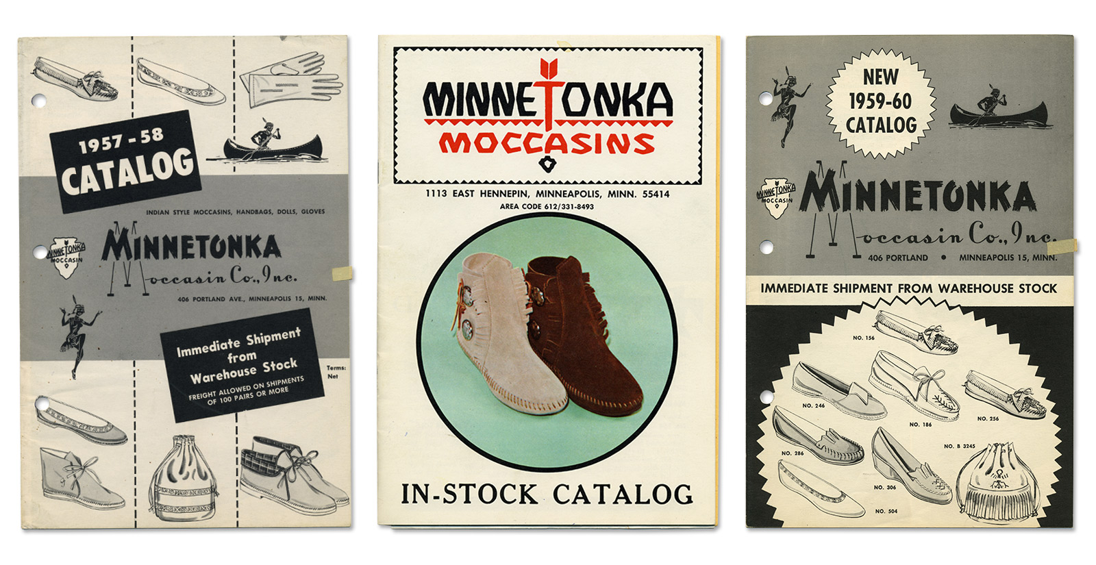

Original Minnetonka Logo
We’ve refined spatial issues and eliminated inapposite elements that do not advance Minnetonka’s desire to articulate a broader lifestyle position within the marketplace.


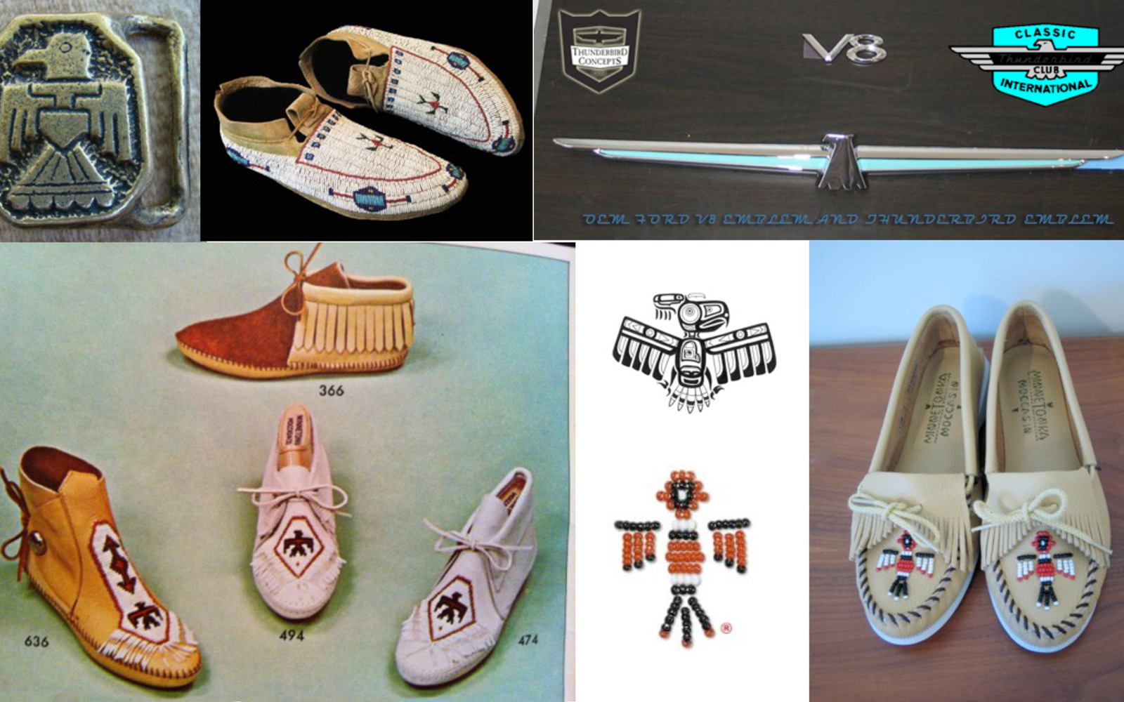
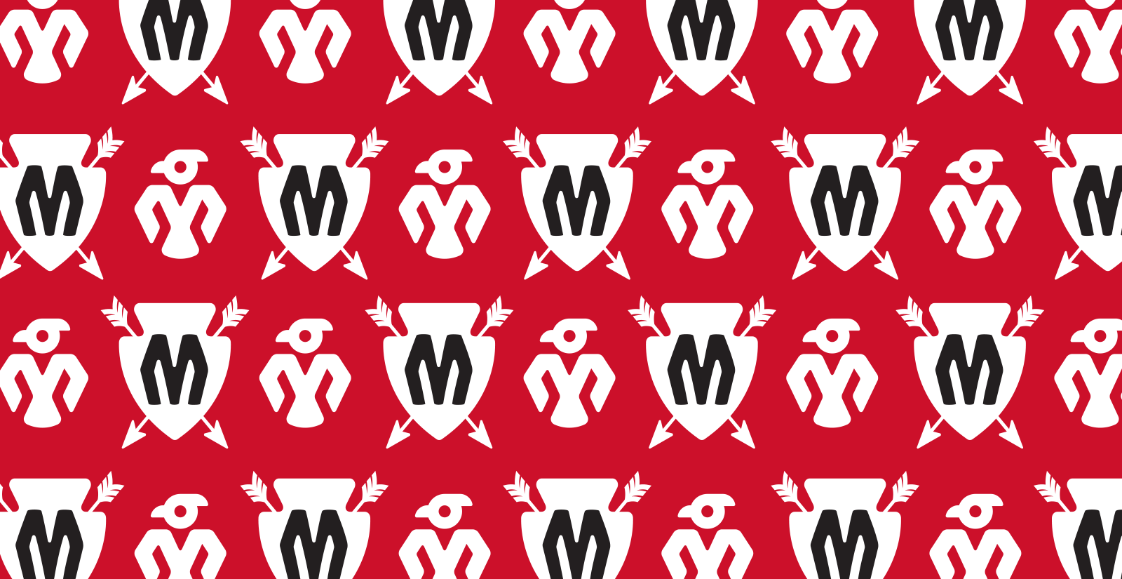
Minnetonka’s past livery of brand assets does not include an element built to work across multiple digital platforms. We leveraged the iconic Thunderbird to create a supplemental mark that resonates with both core and trend audiences.

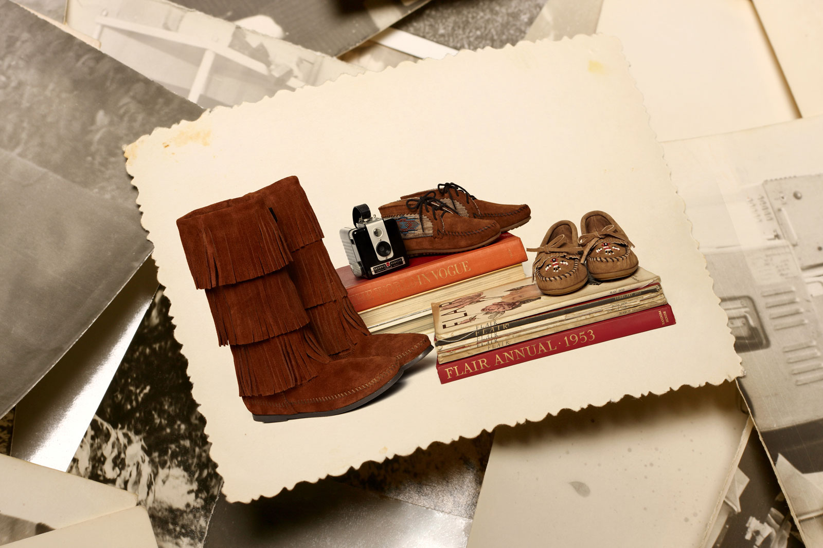
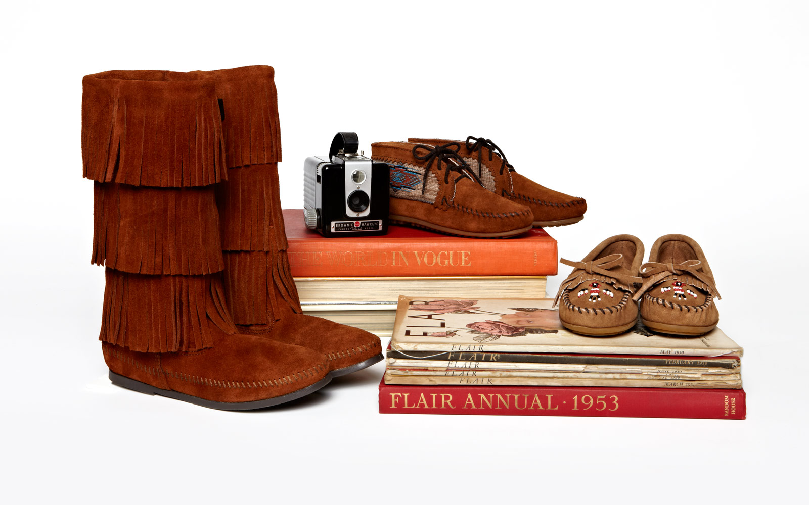
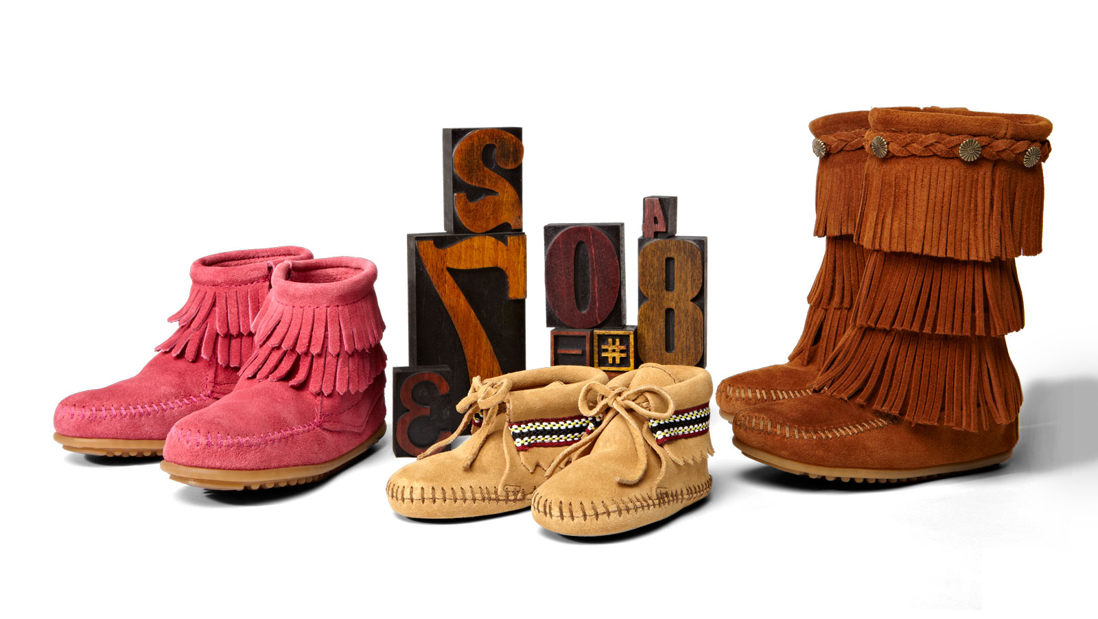
Lifestyle and product photography needed to be addressed to reflect the brand value “high quality.” We proposed a classic editorial approach with refined spatial issues and eliminated elements that didn’t advance Minnetonka’s desire to articulate a broader lifestyle position within the marketplace.




Minnetonka website before rebrand
