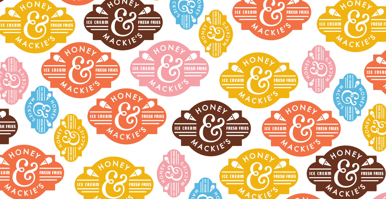
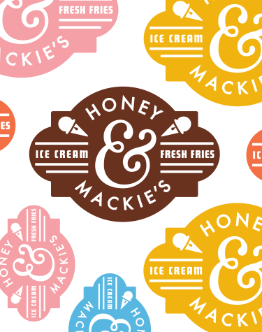
Honey & Mackie’s is an ice cream shop for children that caters to parents. The ingredients in their ice cream creations are all natural, organic and locally grown. The name of the establishment comes from the nicknames of the owners’ own children. With that in mind, we decided that the branding, design and packaging should be modern, authentic and kid fun.
Recently featured in Communication Arts Typography Annual and on Dieline.