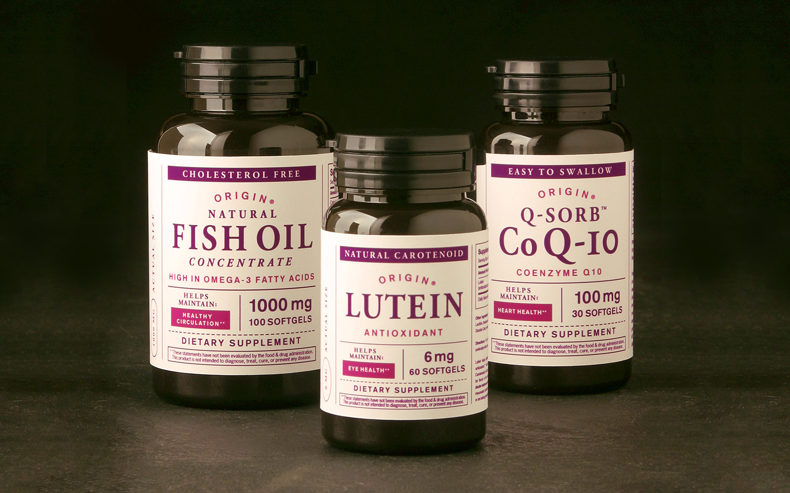
THE CHALLENGE:
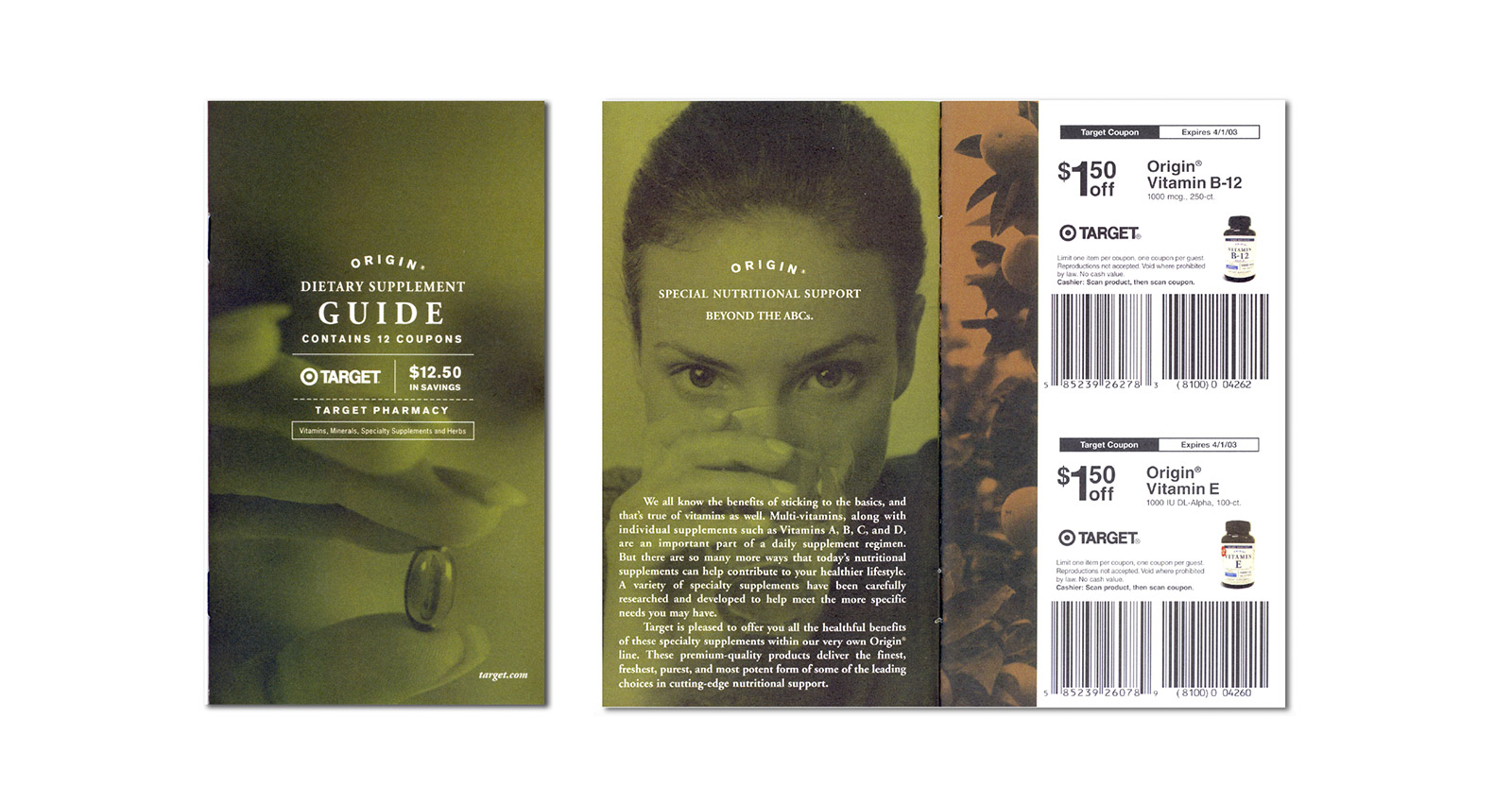
Move the vitamin supplements away from a purely medicinal tone and toward a more holistic and organic approach.
There were vast amounts of information (in multiple layers) that needed to be communicated with limited real estate on the packaging.

THE SOLUTION:
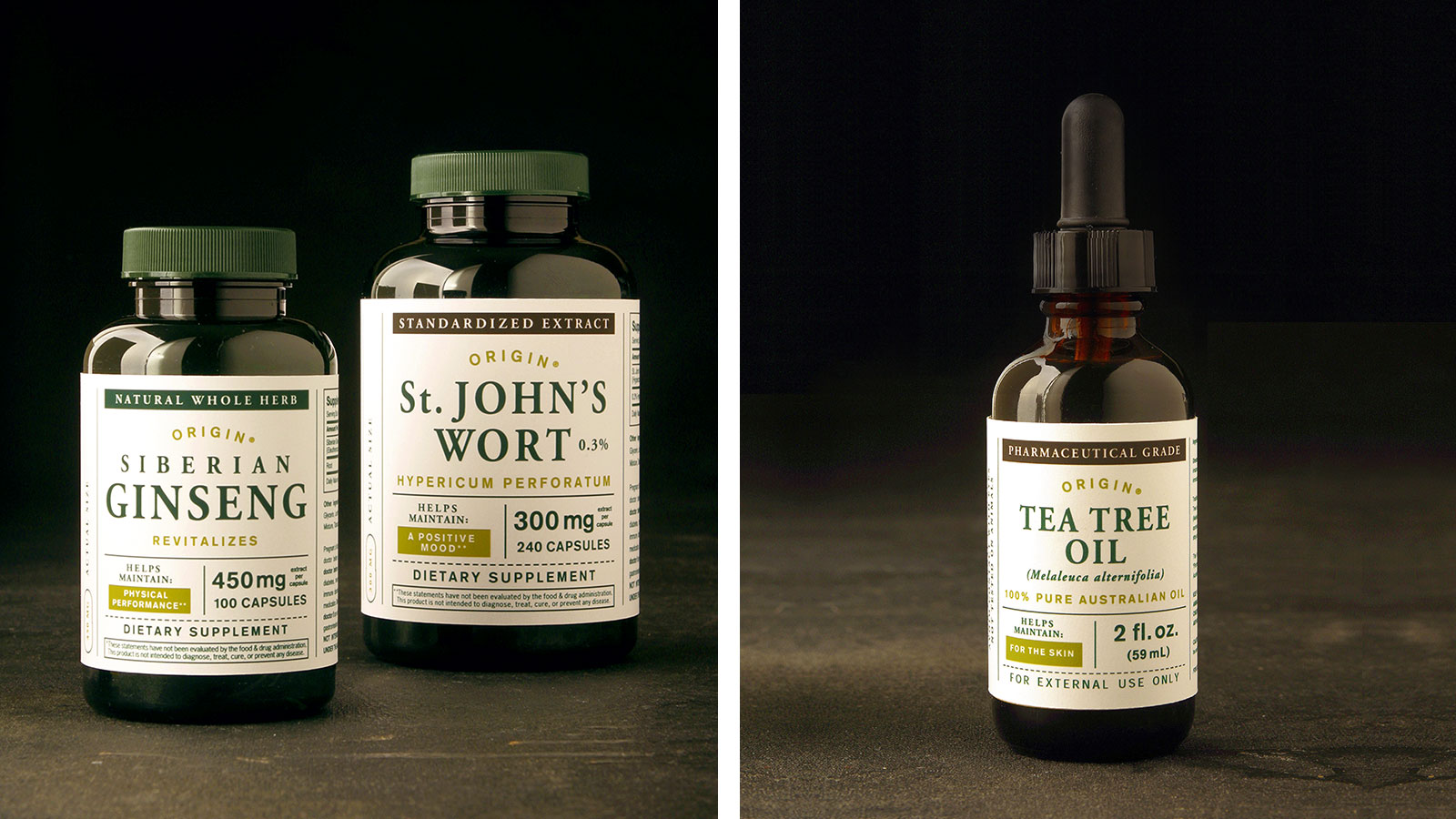
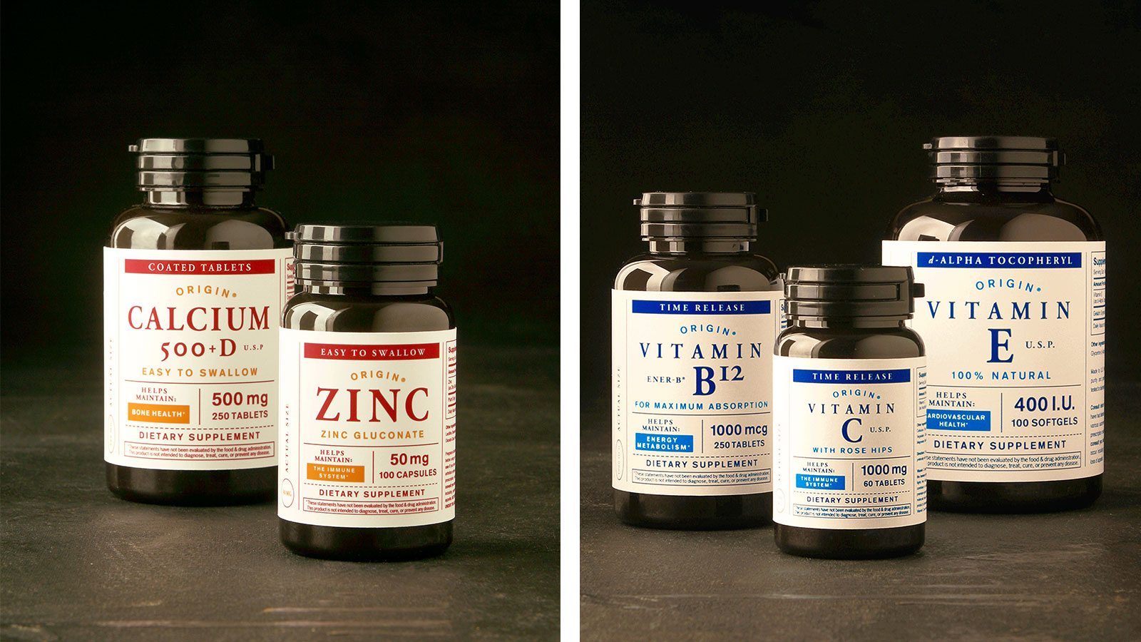
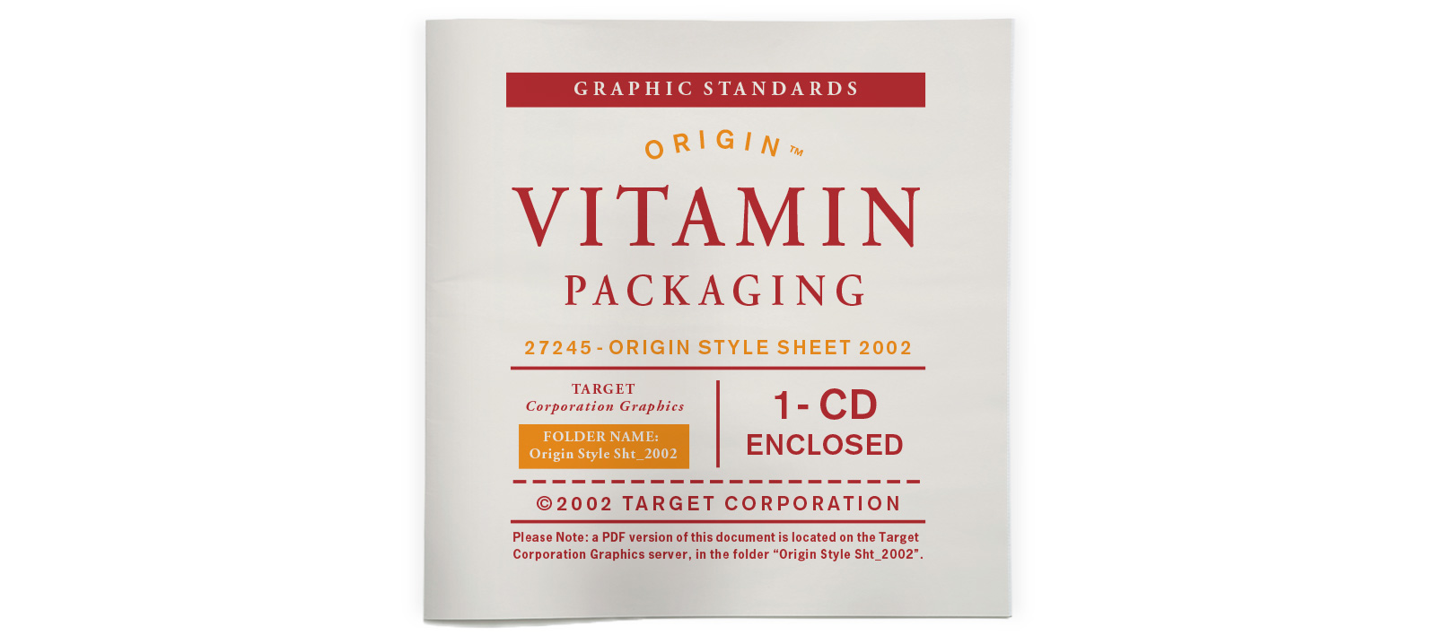
Wink created a straight-forward information architecture that was easily implemented across various bottles and cartons.
This allowed flexibility in container selection and classic typography to create a distinctive “modern apothecary” personality.
The vivid palette of accents differentiates segments and helps identify the relevant information, increasing shelf impact and shopability.


“Wink’s design for the labels and bottles has helped sell millions of dollars worth of these products for Target. It was a huge, huge success.”
Karen Lokensgard | Creative Manager, Target


THE RESULTS:
ROI was off the charts. But the real story is that Target used the branding and packaging for 13 years, which is unprecedented in today’s fast moving retail environment.
